- Have any questions?
- +880-1832219025
- englishrajib877@gmail.com

HSC English -Describing Graph and Chart

Right Form of Verbs Exercises
March 25, 2021
IELTS Speaking Cue Cards-ADVERTISEMENT
March 30, 2021HSC English -Describing Graph and Chart

Let’s learn the HSC English -Describing Graph and Chart
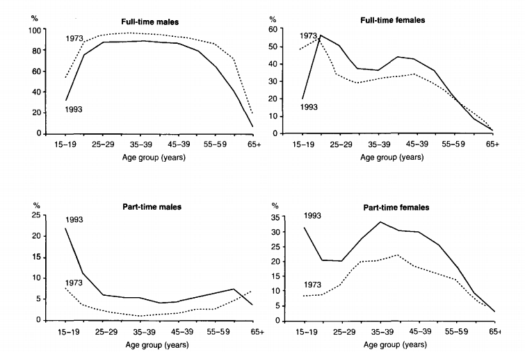
The graphs below show the number of men and women in full and part-time employment in Australia between 1973 and 1993. Write a report for a university lecturer describing the information shown below.
The given graphs depict how many males and females were involved in full and part-time jobs in Australia between 1973 and 1993.
In 1993, the number of men who did full-time jobs was nearly 60% among fifteen to nineteen years old. then there was a slight increase and it reached 90%. For men who were twenty to fifty-nine years old, the percentage of full-time employment had no fluctuations and it was around 90%.
From the age of 59 to 60, there was a slow decrease and it was around 70% . after 60 years, there was a sharp decrease in the percentage of full-time employment of men and it was nearly 20%. in 1993, the percentage of full-time employment of 15 to 19 aged people was around 30%.
Then there was a sharp increase and it was 70%. After that, there was a slight increase of nearly 80% in the age of 25-29 people. And as 1973 there were also no fluctuations from 25 to 40 years old. After that, there was a drastic fall in the percentage of a full-time jobs from the age 59 to 65. In the part-time of males in 1973, the percentage was around 7% wherein in 1993 was around 22%.
In 1973 there was a slight decrease and from 25 to 59 there was not that much fluctuation and from 59 to 65 there was a slow decrease but in 1993 from 7% there was a drastic fall and it was around 10% and after that, there were not that fluctuations.
In conclusion, we can say that the member of full-time males is higher than full-time females and part-time females are higher than part-time males.
HSC English -Describing Graph and Chart
The charts below show the number of Japanese tourists traveling abroad between 1985 and 1995 and Australia’s share of the Japanese tourist market.
Write a report for a university lecturer describing the information shown below.
» You should write at least 150 words.
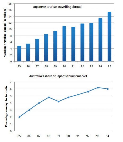
The chart shows us the number of Japanese tourists going abroad and Australia’s share in the Japanese tourist market between 1985 and 1995.
From the first panel, we can infer that Japanese tourists traveling abroad increased greatly during the years. In 1985 about 5 million travelers went abroad. The number increased sharply until 1990 when it was about 11 million. So the number of tourists increased more than twice over those five years. In 1991 there was a little fall. Then it soared again continually up to 1995. In i995 the number of tourists going abroad was about 15 million.
Now we are going to discuss Australia’s share in Japan’s tourist market. The second panel shows us that information from 1985 to 1995. About 2% of Japanese tourists went to Australia in 1985. The figure increased sharply up to 1988 when it was about 5.5%. Between 1988 and 1989 the percentage decreased a little to about 4.3%. Then it began to rise steadily again and reached at about 8.3% in 1993. After that, there was a slight decrease in 1994.
HSC English -Describing Graph and Chart
Eating sweet foods produces acid in the mouth, which can cause tooth decay. (High acid levels are measured by low pH values)
Describe the information below and discuss the implications for dental health.
» Write at least 150 words.
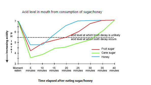
The line graph shows the acid level in the month from the consumption of sweet foods. Here high acid levels are measured by low ph values. Research findings show that when we eat sweet food items, the acid level in our mouth rises. In the given graphs three sweet foods viz; fruit sugar, cane sugar, and honey are compared on the basis of their effects towards ph level in our mouth. When the ph level drops below 5.5, tooth decay occurs.
It can be noticed from the graph that consumption of cane sugar can harm our teeth most as within 5 minutes of taking cane sugar, the ph level in our mouth drops to 3.5 and it takes about 30 minutes for the ph level to go back to the safe level. Honey has been shown to be the least injurious as it does not lower the ph level beyond 4.75 and remains in the danger zone for the minimum time. Within fifteen minutes of having honey, the acid level goes back to the point where tooth decay is unlikely. The negative impact of fruit sugar has been found to be between honey and cane sugar. After eating fruit sugar the ph level drops to 4.2 and remains below the danger level until 20 minutes have elapsed.
HSC English -Describing Graph and Chart
The chart below shows the different levels of educational qualification in Bangladesh and the proportion of men and women who held them in 2003.
Summarize the information by selecting and reporting the main features and make comparisons where relevant.
Write at least 150 words.
The diagram gives information about the participation of men and women at different levels of education in Bangladesh in 2003.
We can find clear differences in the proportion of males and females at different levels. At the primary level, the share of women is almost double compared with that of men. Here the percentages of men and women are 35% and 65% respectively. But the share of women continued decreasing up to the highest level. That implies that the rate of dropout is much higher in the case of women than men. At secondary, higher secondary, and bachelor’s degree levels, the corresponding shares of women are 60%, 55%, and 45% respectively. Keeping the same trend at the highest (master’s degree) level, the share of women was 30% compared with 70% of men.
On the other hand, men’s share was lower than woman’s at the primary, secondary, and higher secondary levels having 35%, 40%, and 45% respectively. But the trend almost reverses at the higher levels of education where men with bachelor’s degrees clearly outnumbered their female counterparts (55% and 45% respectively) and also continued 70% of Master’s graduates. Still, the gender difference is smallest at the Bachelor’s degree level.
")
 Admission Circular and Suggestion(2024)")

")
